It’s a tradition. At the end of the year, I like to post “top” stuff. Here are my best graphs. I’m only going to share graphs that I created with Plot.ly—although there are some other ones out there. So, maybe I should say “best plot.ly graphs of 2019”.
Oh, you haven’t used plot.y? That’s OK. Plotly, is an online graphing platform. It’s pretty nice. The thing I really like is that you can create some data in python (with Glowscript) and send it over to plotly for beautification.
One last thing. I don’t yet know how many “best” graphs I have—I haven’t looked yet. Also, these are in no particular order.
What ball is the best to catch with during free fall?

The graph is from this post—https://www.wired.com/story/the-right-ball-for-playing-catch-while-skydiving/. The idea was to consider what ball would be best to pass back and forth while skydiving.
Modeling a Moon Run
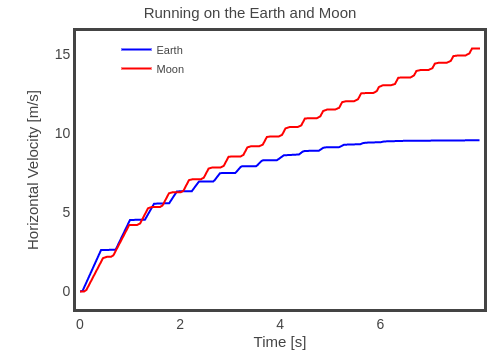
This is from my post looking at the physics of running on the moon. Actually, I really like this stuff. I built a model of a running human in which the final running speed depends on the foot contact time with the ground. I really just made the model so that I could use it for this moon running post.
Oh, bonus—here is my python code for the running model.
All the Jedi Force Jumps

If you look at all the jumps (in all the Star Wars movies) you can measure two things—jump height and jump time. Assuming there is a constant acceleration (not necessarily true) then there is a relationship between time and height.

So, by plotting twice the height by time squared, the slope of the line would give the vertical acceleration. In the graph above, the green line is for an acceleration of 9.8 m/s^2 (the value on Earth) and the red line is the average for all the Jedi. Notice that Yoda has a greater acceleration. I think that’s cool.
Oh, bonus video. Here are all the Jedi jumps.
